
My first coding project found something six specialists had missed
TL;DR. My first coding project ran on nine years of my own Apple Watch data. One prompt to Claude surfaced an 18% jump in resting heart rate starting late 2020. That was the signal that led to a POTS diagnosis after six specialists had missed it. The methodology, and its limits, follow.
By mid-2025, I realized my relationship with my Apple Watch had shifted. It was now a nagging appendage, seeming to persistently tell me to breathe and relax. It would happen at the end of the workdays. I’d be at my desk in Arlington, working through email, and the watch would buzz: time to breathe. I’d put it on do-not-disturb. A few minutes later it would buzz again.
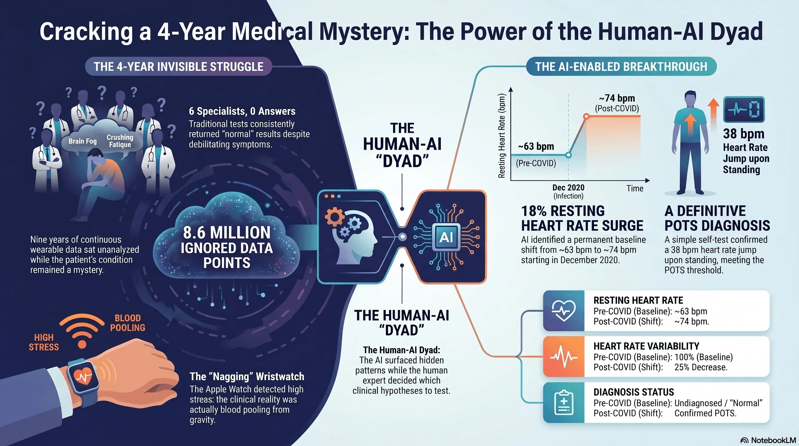
I’m a pathologist. For the previous four years I’d been going from doctor to doctor with a set of strange symptoms: brain fog, crushing afternoon fatigue, migraines, an exercise intolerance that didn’t match anything in my history. Seven visits across six specialties. Nothing was ever wrong with me.
The watch was nagging me. The doctors weren’t.
Here’s what was actually happening, though I didn’t know it yet. By late afternoon the blood was pooling in my legs from gravity and prolonged sitting. My heart rate was climbing to compensate. The Apple Watch reads an elevated resting heart rate as stress, so it was kindly suggesting I take a few deep breaths. The watch was right that something was off. It was wrong about why.
That fall, I joined Coa Solutions as Consulting Chief Medical Officer.
A small public-sector AI company in Arlington
Coa is a Service-Disabled Veteran-Owned Small Business based in Arlington, Virginia. It was founded in 2022 by Ari Perez (CEO), a West Point graduate and Army veteran with seventeen-plus years inside federal technology, and Phillip Jo (COO), who has spent two decades in product and design leadership. Coa builds AI-powered tools for the VA, the IRS, and other federal agencies. The design thesis is one I now think about constantly: AI that recommends, while humans decide. The flagship effort uses AI to help the doctors that care for Veterans process more than fifty million pages of mixed-format federal records, accelerating veterans’ benefits decisions.
Inside that thesis is a more specific organizational bet: the dyad. Coa pairs domain experts who can develop (clinicians, analysts, federal subject-matter specialists) with a technical specialist who can troubleshoot, validate, and quality-control. The structural template comes from a practice I knew well from my time at Mayo Clinic. Mayo pairs physician leaders with administrative leaders in formal dyad relationships, where each leads from a different part of the work. Coa applies the same idea to AI-enabled work. The clinician brings clinical reasoning and domain judgment. The technical specialist brings methodological depth and a second pair of eyes. This dyad does work neither could do alone.
I came on to help Coa build out its clinical strategy. As part of my onboarding, Ari and Phillip did something I’ve never seen another company do for a senior clinician hire. They spent the first four to five months teaching me how to code. Not how to use code. How to write it, in their actual workflow, with Claude as the primary collaborator and a stack of agents around it. I’d spent fifteen years building diagnostic AI in pathology at the NIH, Google, Mayo Clinic, and AstraZeneca. I knew the science of building diagnostic tools intimately. I’d never been the person at the keyboard.
Five months in, Ari started calling me a coder. I would have hedged on the word, but by then the workflow had become natural enough that the case study below was even possible. The path ran the other direction from Ari’s framing of the engineering layer dissolving into the work: clinician into coder, then coder back into clinician, only now with eight million data points in hand.
I had one dataset
During onboarding I had no client data to practice on. Coa’s clinical engagements were still being scoped. What I did have access to was one large, longitudinal dataset that mattered to me: nine years of Apple Watch data from my own wrist. Continuous monitoring across three device generations (Series 1, Series 8, Ultra 2) going back to September 2017. About 8.6 million measurements. Forty different metrics. A small clinical biography sitting on my wrist, mostly ignored.
So Ari built a SQLite database of it. And then I asked Claude one question.
The prompt was a single sentence: “I have uploaded all my Apple Watch data and I want you to take a pure data science driven approach and tell me what you see in the data.” No clinical context. No mention of symptoms. No mention of COVID. This was deliberate. In pathology, you look at the H&E slide before you read the clinical history. You don’t want to impart bias to what you’re seeing. Data science calls the same discipline exploratory analysis: let the data speak first, then ask the questions. I wanted whatever the model surfaced to come from the data, not from what I expected the data to say.
Within a few minutes, the model came back with a finding. Something was different about the last few months of 2020; a new normal. My resting heart rate had stepped up from a baseline near 63 bpm to a new baseline near 74 bpm. An 18% increase, persistent for years. My heart rate variability had dropped by about a quarter over the same window. The model couldn’t explain why. It just showed me where the line moved.
My first reaction was to ask my wife when, exactly, I’d had COVID. I knew it had been around 2020. I didn’t remember the month. She did: December 2020. I lined up the dates. They matched.
The part of the story I want to be careful about
This is the part of the story where I want to be careful, because the easy version (“AI saw what my doctors couldn’t”) is wrong. And I think the easy version is part of why a generation of AI-in-medicine stories has done more harm than good.
None of us made a diagnosis alone. The model surfaced a pattern. The methodology I borrowed from pathology made it testable. A specialist confirmed it. Ivabradine resolved it.
Pathology gave me the framework. When you sign out a tissue case, you start with the unbiased look. H&E staining, looking at the slide directly before you read the chart. Then you order ancillary studies (immunohistochemistry, molecular, FISH) based on what you saw. Each ancillary study tests a specific hypothesis. At the end you make sure the whole picture is internally consistent before you sign your name. I treated my own data the same way. The first prompt was the unbiased look. After that I ran roughly forty-five directed analyses (ancillary studies, in pathology terms), each one testing a specific hypothesis, each one returning a piece of evidence to evaluate.
Two of those analyses produced findings I had to reject.
The first looked like a striking pattern of weekday stress. My heart rate seemed worse on Mondays and Tuesdays. It was an autocorrelation artifact in time-correlated daily data. I learned what that meant by debugging it.
The second looked like the strongest possible evidence that “standing too much” was making me crash. Days when I stood more were followed by days when my heart rate ran lower. The mechanism made physiological sense. The finding was real. The interpretation was wrong: I stood more on days when I already felt better. The arrow of causation ran the other direction. I started calling this the Good-Day Paradox, and I think it generalizes to most retrospective wearable analyses in chronic illness. The patient pattern that looks like a cause is often a consequence.
I share these because they’re the part of the story the AI-cures-everything narrative leaves out. If I’d stopped at the model’s first plausible-sounding answer, I would have written a confident paper about the wrong thing.
I should also be clear about what kept the technical foundation honest. Throughout the analysis, Ari was my technical partner. The dyad in practice. He configured the analytical environment and validated the code itself, script by script, making sure the Python and SQL the model produced actually did what the model claimed they did. The methodological choices (which findings to question, which to reject, what to bring to the specialist) were mine. But I would not have trusted any of them without Ari’s check on the substrate. The model surfaced patterns. Pathology gave me the framework to test them. Ari made sure the analyses I ran were running cleanly underneath.
What survived the methodology
The hypothesis that survived was straightforward. My COVID infection had triggered a sustained autonomic shift, and the resting tachycardia, fatigue, and brain fog were features of postural orthostatic tachycardia syndrome. POTS. It affects between one and three million Americans. The mean diagnostic delay is four to seven years.
There’s an iPhone app called TachyMon designed for exactly this kind of self-test. I lay flat for ten minutes, then stood up. My heart rate went from 74 to 112 within seconds and stayed elevated for more than fourteen minutes. The diagnostic threshold for POTS is a sustained increase of 30 beats per minute. Mine was 38.
I took the data (sixteen pages of charts and analysis) to a sports cardiologist who specializes in POTS. He read the report, asked me a series of pointed questions about my history and the trajectory of the symptoms, and made the diagnosis. He started me on ivabradine, a heart-rate-controlling medication that doesn’t drop blood pressure.
The symptomatic response was almost immediate. Within days the afternoon fatigue had lifted, the brain fog had cleared, and the exercise intolerance was receding. A week later my resting heart rate had stepped down from 68 to 55 bpm. The graph from my watch shows it as a knife edge: one line on one day, a different line the next. The migraines slowed over the weeks that followed.
Seven weeks after starting treatment I did a formal cardiopulmonary exercise test at a sports medicine clinic. My VO2 came in at 30.8 ml/kg/min, 93% of age-predicted normal. The deconditioning hypothesis I’d been quietly worried about (that I’d simply gotten too sedentary to recover) was decisively wrong.
Six months later
Since the original analysis, two things have changed about how I work with this data.
The first is that I added an Oura ring. The Apple Watch is still on my wrist, but Oura sits better on me overnight: smaller, lighter, designed for sleep. It also exposes a clean API. Where the Apple Watch analysis required a manual export and a SQLite build, the Oura side connects directly. The data flows in.
The second is that I built a dashboard. Apple Watch data and Oura ring data populate it together. I look at heart rate trajectory, HRV, sleep, and a small set of symptom tags I enter myself. When I have a hard day, I can see whether something autonomic is upstream of it. When the dashboard shows resting heart rate creeping back toward the pre-treatment baseline, I know to call my cardiologist before the symptoms catch up to the data.
This is not a product. It’s one patient’s instrument, kept on a laptop in Arlington. But increasingly, it’s the answer to the question I keep being asked after I tell this story: “How would I do this without being a pathologist who knows how to code?” The honest answer is: not the way I did it. Whether it ever becomes anything more than one patient’s instrument is a separate question, and one I don’t have an answer to yet.
What this is, and what it isn’t
I want to be honest about what this is.
This is closer to real-world evidence than to a clinical trial. The data is passively collected, longitudinal, and observed in everyday life. n=1. Retrospective. No formal tilt-table test. Simultaneous lifestyle changes that ran alongside the medication. Real-world evidence has its own established place in clinical research alongside trials. What it captures that trials can’t is the long observation window and the real-life conditions. What it can’t do, on its own, is establish causation the way a controlled trial does. We’re a small public-sector company, and we don’t currently have the funding to design and run the prospective study that would turn this real-world signal into trial-grade evidence. If somebody wants to fund that work, I’d love to do it.
I should also be honest about what enabled this case in particular. Most patients with similar symptoms don’t have nine years of continuous wearable data, fifteen years of professional context in diagnostic AI, an AI company willing to invest in their training, and a technical partner to keep them honest. This case is a proof of methodology. It is not yet a portable solution. The portable solution (tooling and care pathways that bring the same kind of analysis to people who don’t happen to be pathologists) doesn’t exist yet. Building it is part of the point.
What I can say is that the methodology worked, in a way it could not have five years ago.
Five years ago, the analytical work I did would have required a research team: a biostatistician, a data engineer, a clinical research coordinator, weeks of meetings to align on what to look for. The headline of this case isn’t that AI is smart. It’s that AI is now an accessible substitute for a small team of professionals, when the person directing it knows what questions to ask.
The microscope didn’t make pathologists. Pathologists make microscopes useful. The same is true here. And it’s a near match for Coa’s design thesis: AI recommends, humans decide.
Why this is my first project at Coa
That’s why this story matters to me as my first project at Coa.
The reason Ari and Phillip invested four months of onboarding in teaching a pathologist how to code with Claude wasn’t to turn me into a software engineer. It was to make me functional with tools that, until very recently, only software engineers and data scientists could use. The thesis underneath that bet (that domain experts paired with modern AI tools can now do work that used to require entire teams) is the thesis we’re trying to build a company around. The first thing I did with the training is something close to the most personally meaningful thing I have ever done in medicine. I think that’s evidence the thesis is right.
If you’ve lived through a long diagnostic odyssey, I’d like to hear from you. One case study is not a clinical trial. It’s a starting point, both for me and, I hope, for someone else who’s currently being told their tests are normal.
I’m grateful to my collaborators at Coa, Ari and Phillip and the team. To the cardiologist who read my data with an open mind. To my family, who kept showing up through four years of every test is normal. And to a wristwatch that wouldn’t stop nagging me to breathe.
Jason Hipp, MD, PhD is the Consulting Chief Medical Officer at Coa Solutions, a Service-Disabled Veteran-Owned Small Business based in Arlington, Virginia, working on AI-powered tools for the VA, the IRS, and other federal agencies. He is a board-certified anatomic pathologist with fellowship training in clinical informatics. Before Coa, he spent fifteen years building diagnostic AI tools in computational pathology at the NIH, Google, Mayo Clinic, and AstraZeneca.
This piece describes a single patient experience. It is not medical advice. If your wearable is showing you patterns you don’t understand and you have symptoms that aren’t being explained, talk to a clinician, and consider bringing your data with you.